
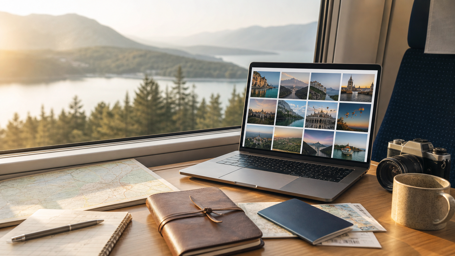
AI image generators are tempting for travel creators because they can turn a rough idea into a polished-looking visual in seconds: a rainy street in Lisbon, a desert road trip packing list, a quiet ryokan hallway, a map-inspired newsletter header.
The harder part comes next. You make one image you like, then try to make five more for the same guide or campaign. Suddenly the colors shift, the mood changes, the level of realism jumps around, and your once-cohesive project starts to look like a folder of unrelated stock images.
For travel blogs, itinerary PDFs, social carousels, trip-planning presentations, and destination newsletters, consistency matters. It helps readers feel oriented. It makes a series recognizable. It also saves you from rewriting giant prompts every time you need a new visual.
The practical solution is to separate two jobs: let your written prompt describe the travel scene, and let a moodboard or style reference carry the visual direction.
Why travel projects need visual consistency
Travel content often covers varied subjects within one project. A single city guide might need visuals for food markets, hotel neighborhoods, transit tips, rainy-day activities, museums, and day trips. A nomad newsletter might jump from laptop-friendly cafés to visa reminders to packing advice. A tour proposal might include landscapes, people, interiors, and maps.
If every image has a different style, readers may not consciously know what is wrong, but the project can feel scattered. Consistent visuals create a visual thread even when the subjects change.
This is especially useful for:
- Blog post hero images across a travel website
- Newsletter thumbnails for recurring destination features
- Social media series about one trip or region
- Custom itinerary PDFs for clients or friends
- Presentation decks for travel brands, retreats, or group trips
- Personal trip journals where you want a unified look
The goal is not to make every image identical. A café scene should not look exactly like a mountain pass. The goal is for the images to share enough qualities—palette, texture, composition, light, level of detail—that they feel like they belong to the same travel story.
Build a moodboard with a specific travel point of view
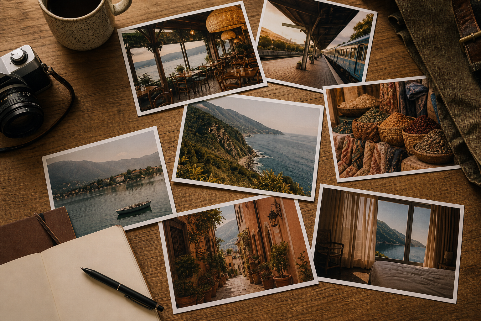
A moodboard is a collection of reference images that tells an image generator what kind of visual world you want. Depending on the tool, it may be called a moodboard, style reference, visual reference, or something similar. The name matters less than the principle: you are showing the tool the look you want instead of trying to describe every stylistic detail in words.
For a travel project, start with a narrow point of view. “Beautiful travel images” is too broad. “Warm editorial illustrations for a slow-travel guide to southern Italy” is much more useful. So is “soft, natural-light photography for a minimalist hotel neighborhood guide” or “muted map-and-journal-inspired visuals for a rail itinerary through Japan.”
For your first board, choose around five to eight reference images. They do not need to show the same subject. In fact, variety can help. You might include a street corner, a breakfast table, a train platform, a landscape, and a hotel room. What matters is that they share visible traits.
Look for consistency in:
- Color temperature: warm, cool, muted, high contrast, pastel, earthy
- Lighting: soft morning light, cloudy daylight, dramatic shadows, golden hour
- Composition: centered subject, lots of negative space, close-up detail, wide scenic view
- Medium: editorial photography, watercolor illustration, cut-paper collage, ink drawing
- Detail level: realistic and crisp, simplified and graphic, textured and loose
- Travel feeling: quiet, luxurious, adventurous, nostalgic, practical, urban
Then zoom out and view the references together as small thumbnails. This is a useful reality check. If one image looks like it belongs to a different project, remove it. A single glossy, neon-lit city image can pull a calm natural-light board in the wrong direction. A character-heavy illustration can cause future object images to sprout faces or human-like features. A board does not need to be large; it needs to be clear.
Keep the prompt responsible for the scene, not the style
Many people try to solve inconsistent images by making their prompts longer. That can backfire. Long prompts often mix subject, composition, mood, medium, color, camera details, and brand language into one crowded instruction. The image model then has too many competing signals.
A cleaner approach is to let the moodboard control the style and let the prompt describe what appears in the image.
For example, if your moodboard already establishes a soft, muted, hand-drawn look, your prompt does not need to say “soft muted hand-drawn watercolor editorial travel illustration with paper texture” every time. Instead, describe the travel scene clearly:
- “A small café table with two espresso cups, a folded city map, and a rain jacket on the chair, three-quarter view, generous empty space”
- “A traveler waiting alone on a rural train platform at dawn, wide composition, suitcase beside them”
- “A compact carry-on suitcase open on a hotel bed, packing cubes and a lightweight jacket visible, overhead view”
Those prompts focus on subject, setting, composition, and scale. The moodboard supplies the shared visual treatment.
This division is useful because travel images often need to communicate quickly. A newsletter thumbnail about train travel should read as train travel at a glance. A guide section about packing should not become an overstuffed fantasy scene. Simple scene prompts are easier to correct when something goes wrong.
A practical workflow for one travel series
Here is a straightforward way to use this method for a real travel project.
1. Define the series before choosing references
Write one sentence that describes the project’s visual job. For example:
“Create a cohesive set of warm, calm visuals for a seven-part newsletter series about slow travel in Portugal.”
This sentence keeps you honest when choosing references. If an image is gorgeous but feels icy, futuristic, or chaotic, it probably does not belong.
2. Gather five to eight references
Choose images that share the same visual language, even if the subjects vary. For a Portugal slow-travel series, your references might include a quiet tram street, tiled building detail, café table, coastal path, guesthouse window, and market stall—but only if they share the same tone and treatment.
Avoid adding references just because you like them individually. A moodboard is not a scrapbook. It is a set of instructions.
3. Generate a small test set
Pick three different travel subjects and run simple prompts using the same moodboard or style reference. Good test subjects are deliberately different, such as:
- A train station waiting area
- A seafood lunch table
- A cliffside walking path
If all three feel like they belong together, your board is working. If they look unrelated, the board may be too mixed. If unwanted elements keep appearing—faces on objects, the same landmark in every image, overly dramatic skies—inspect your references for the source of that pattern.
4. Remove outliers and regenerate
Consistency improves through editing. If one reference has a very different medium, palette, or subject emphasis, remove it and test again. If your travel series needs mostly places and objects, but your board contains many portraits, the generator may keep adding people. If you want quiet editorial images, but one reference is cinematic and high contrast, that drama may spread.
Think of the board as a small travel capsule wardrobe: every piece should work with the others.
5. Save the best results back into the system
As you generate images that match your direction, you can use the strongest ones as future references if your tool supports it. This helps the visual identity become more specific over time. Be selective. Do not add every decent output. Add only the images that represent the direction you want more of.
Common mistakes that make AI travel visuals feel messy
Even a good workflow can drift. Watch for these common problems.
Mixing too many destinations in one board
If you are creating a global travel brand style, your references can come from many places. But if you are making visuals for one destination guide, be careful. A moodboard that includes Tokyo alleys, Moroccan courtyards, Swiss chalets, and Caribbean beaches may produce beautiful but confusing results for a Rome itinerary.
Using landmark-heavy references
Famous landmarks can dominate. If your board includes several recognizable monuments, the model may keep inventing landmark-like structures even when your prompt asks for ordinary scenes. For flexible travel visuals, references based on light, composition, texture, and everyday details are often more useful than postcard icons.
Letting personal taste settings compete with the board
Some tools learn from your past likes or rankings and apply that taste automatically. That can be helpful later, but when you are testing a new moodboard, it can muddy the results. If your tool allows it, turn off broader personalization while you evaluate the board. You want to know what the board itself is contributing.
Overdescribing the artistic style
If your prompt says the image should be photographic, watercolor, cinematic, minimalist, vintage, pastel, hyperreal, and editorial all at once, the output will have to negotiate those contradictions. When using a moodboard, keep style words to a minimum unless you are correcting a specific problem.
Forgetting the final use size
A detailed image may look impressive full-screen but fail as a small thumbnail. Travel creators often need images for cards, headers, or social posts where clarity matters. Ask for simple compositions, clear subjects, and enough empty space for layout needs—even if you are not placing text inside the image itself.
When moodboards are worth the effort
If you need one image for a personal travel mood, building a full system may be unnecessary. A simple prompt or a built-in style reference can be enough.
Moodboards become worthwhile when you are producing a set: ten blog headers, a recurring newsletter, a destination guide, a client itinerary template, or a long-running social format. The time you spend shaping the board pays off because each future prompt can be shorter and more predictable.
There is still uncertainty. AI image tools may misinterpret objects, invent details, distort maps, add extra limbs to people, or produce architecture that does not match a real place. For factual travel information—routes, safety notices, visa rules, opening hours, accessibility details—do not rely on generated images as evidence. Treat them as editorial visuals, not documentation.
A simple rule for better travel image prompts
Before you generate, ask two questions:
- What should the reader immediately recognize in this image?
- What should make it feel like part of the same series?
Put the answer to the first question in your written prompt. Put the answer to the second question in your moodboard.
That separation keeps your travel visuals clearer, calmer, and easier to repeat. Instead of reinventing your style for every café, ferry, hiking boot, guesthouse, and train platform, you can build one visual direction and let each new scene live inside it.
Your FREE Copy-Paste Prompt
Turn a Travel Visual Idea Into Three Clean Image Prompts
Use this with ChatGPT or another writing assistant when you already have a moodboard or style reference in your image tool and need concise prompts for a cohesive travel series.
I’m creating AI-generated editorial visuals for a travel project. I already have a moodboard/style reference that controls the overall visual style, color palette, texture, and mood, so do not add style labels, artist names, medium descriptions, or color instructions unless necessary for the scene.

Project: [describe the travel project, e.g., “a 6-part email series about slow travel in Portugal”]
Where the image will appear: [blog hero / newsletter thumbnail / itinerary PDF / social carousel]
Destination or travel context: [place, region, route, or trip type]
Image idea: [rough idea, e.g., “packing for a rainy city break”]
Aspect ratio: [e.g., 16:9, 4:5, 3:4]
Important constraints: [e.g., “no readable text, no logos, no recognizable app screens, avoid famous landmarks, leave negative space on the right”]

Create three concise image-generation prompts for the same idea. Make the options different in composition or camera distance, not in visual style. Each prompt should clearly describe the subject, setting, composition, and lighting in one sentence. Keep the scene simple enough to understand at small thumbnail size. Return only the three prompts.